Why Your Shopify Store Looks Cheap (And It Has Nothing To Do With Your Products)

You spent months developing your product. The quality is there. The packaging is right. Your customers who find you love what they get.
But something about your store feels off. It looks fine. It just does not look like you mean it.
This is one of the most common things I see when I do a Brand Review. Great products sitting inside a storefront that undercuts them at every turn. And almost every time, the problem is not the product. It is five specific things that are quietly making the whole experience feel less premium than it should.
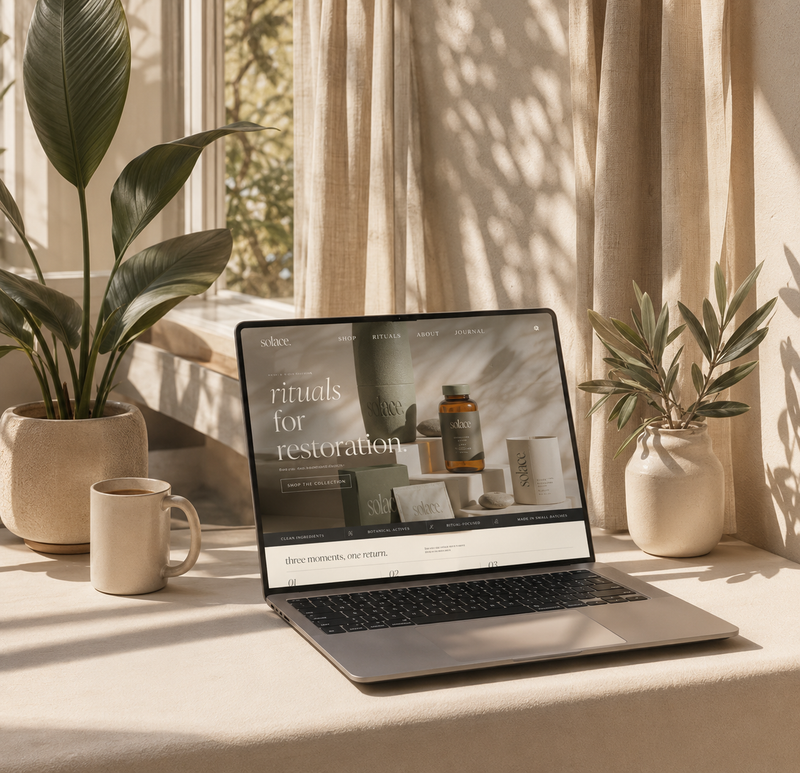
1. Your fonts are doing more damage than you think
Most Shopify store owners pick fonts from a dropdown and never think about them again. But fonts carry enormous weight in how professional a brand feels.
The combination that kills credibility faster than anything else: a thin sans-serif for headings and a generic system font for body copy. It reads as unfinished. It says "I picked the default."
What premium brands do instead: they pair a strong, weighted display font for headlines with a clean, readable body font. The contrast creates hierarchy. Hierarchy creates polish. Polish creates trust.
Before you change anything else on your site, look at your fonts. If you used whatever Shopify suggested when you installed your theme, it is worth revisiting.
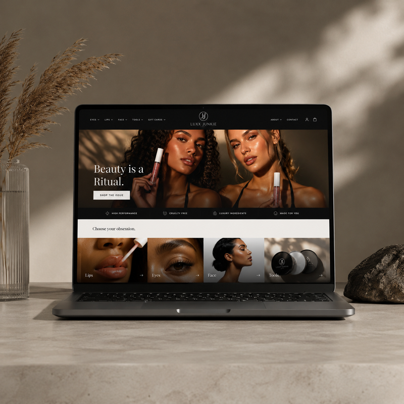
2. Your images are inconsistent and your store knows it
Nothing fragments a brand experience faster than photos that do not match each other. One product shot on white. One on a wood table. One in natural light. One in a studio. Scrolling through feels like flipping through three different brands.
Consistency does not mean every photo looks identical. It means they all feel like they belong to the same world.
If you do not have the budget for a reshoots, AI product photography has become genuinely excellent. I have built entire brand campaigns for clients using AI-generated images that are indistinguishable from studio photography. The Solara Jewelry case study on my site is 100% AI imagery. You cannot tell.
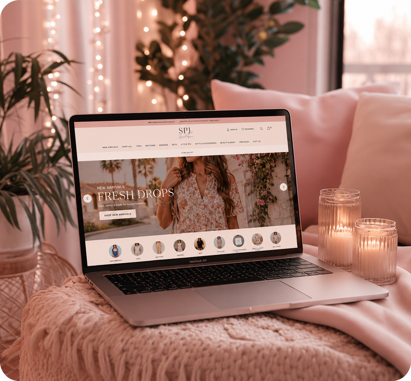
3. Your homepage is trying to say everything at once
Most Shopify homepages I audit have the same problem: they are trying to introduce the brand, explain all the products, share the brand story, build trust, and convert the visitor all at the same time, in the first scroll.
The result is a page that feels overwhelming and communicates nothing clearly.
Your homepage has one job: get the right person to take one next step. That is it.
Ask yourself: what is the single most important action I want a first-time visitor to take? Then design the page around making that action completely obvious. Everything else is secondary.
4. Your product pages are not doing any selling
The product page is where the sale actually happens. But most store owners treat it like a filing cabinet. Title. Price. Description. Add to cart. Done.
What that layout is missing: the emotional logic of why someone should buy this specific product, from you, today.
Strong product pages answer three questions before the visitor has to ask them:
What is this and what does it do for me?
Why is this better than the alternatives?
Why should I trust that it will actually deliver?
If your description is just a list of features or a paragraph of generic copy, it is probably losing you sales every day.
5. Your mobile experience is an afterthought
This one is non-negotiable in 2026. Somewhere between 60 and 80 percent of your traffic is on a phone. If your store was designed on a desktop and "made responsive" by whoever built your theme, it is probably not actually good on mobile. It is just technically usable.
Good mobile design means text that is readable without zooming, buttons that are easy to tap, product images that load fast and show the product clearly, and a checkout flow that does not require a PhD to complete.
Pull up your store on your phone right now. Navigate through it like a first-time customer. If anything feels awkward, slows you down, or makes you think at all, that friction is costing you conversions.
The honest fix
Most of these problems do not require a full redesign. They require a clear-eyed audit of what is actually happening versus what you intended.
If you want a professional read on exactly what is holding your store back, a Brand Review will give you a prioritized list of what to fix first and why. Most clients walk away with a completely different understanding of their store than they came in with.
Your brand deserves a real audit.
A Brand Review goes through your entire online presence and gives you a prioritized plan to fix what matters most. Most clients walk away seeing their business completely differently.